Typography
Typography brings clarity and personality to our messaging.
Typefaces
Brand Typeface
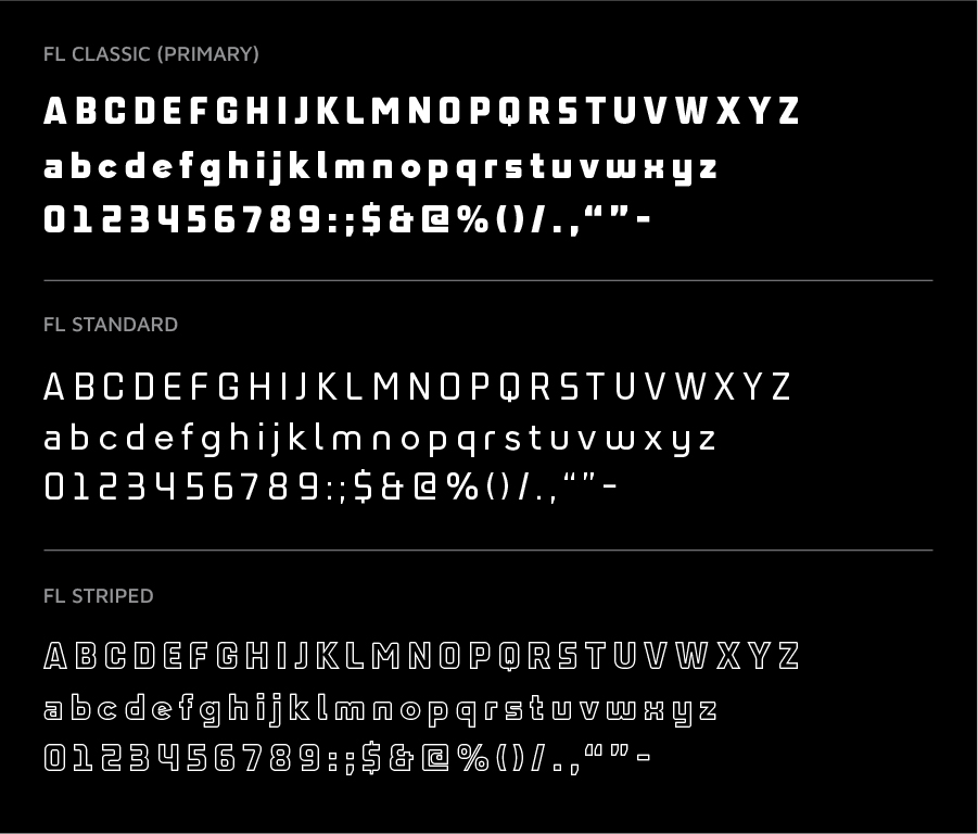
This is our custom Foot Locker typeface. The letterforms are an extension of our Foot Locker logo.
The Foot Locker Typeface family comes in three styles that may be used individually, or in concert with each other.
Digital Typeface
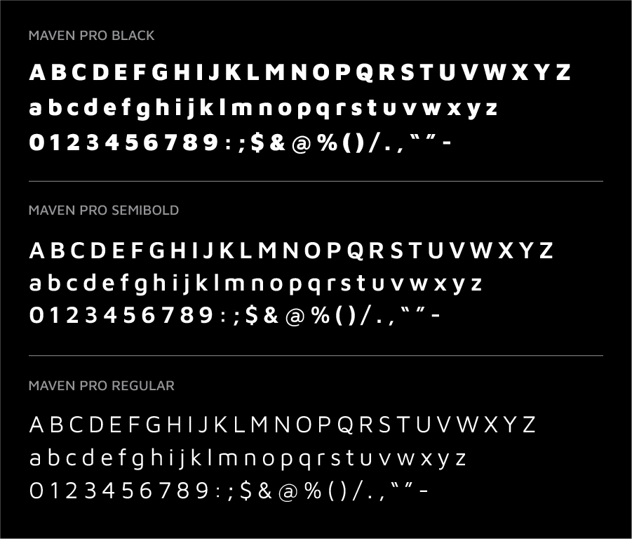
Maven Pro is Foot Locker’s secondary and digital format typeface. This type family partners well and compliments the custom Foot Locker type family.
It is also a widely accessible digital font which offers ease of use on multiple platforms.
Korean Typeface
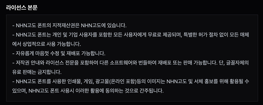
For Korean markets, the typeface Godo should be used for all headers and body copy.
Font Hierarchy
Brand Type Stack
Here are some basic styles to consider when designing blocks of written content.
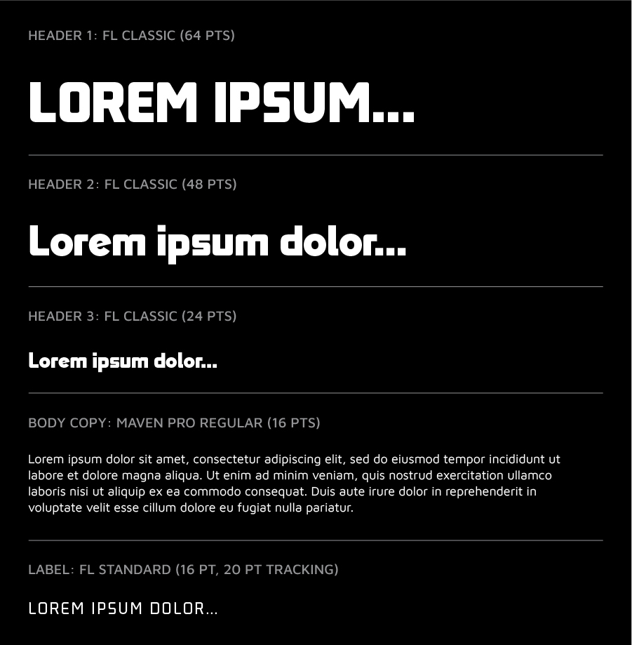
Digital Type Stack
The digital font hierarchy is deeper and more explicit due to the needs of our website and app.

Font Rules and Misuse
Font Size
Type size depends on the size of the space, but headlines should fill the available width. All text should be sized for ease of legibility.


Leading
Leading should be 1.25x – 1.5x the font size. Ascenders and descenders should never overlap with one another.


Tracking/Kerning
Headlines can be kerned 0–25pts to give the letters breathing room. All other text should remain at 0.


Pairing
Display font should not be used for both primary and secondary copy. Type should have a variety of weights when paired together for copy.


Typography Hierarchy For Headlines
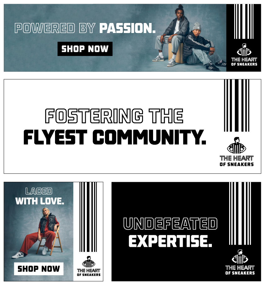
Use the FL Striped typeface to lead into the messaging with Foot Locker Classic finishing the punctuating statement or word of the headline.
In most cases, the typography should always be centered for maximum impact. There should be enough negative space around the headline so it does not interfere with any other elements around it.

Typography Hierarchy Usage Examples
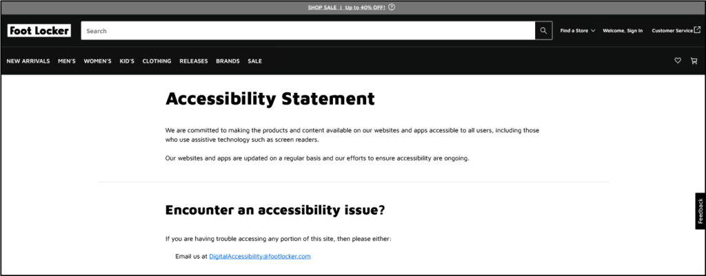
Here are best practice examples for proper typography usage for simple headlines using the brand typeface in print and the digital typeface for specific applications.
When using the digital typeface in application, consider all spacing and usage rules.
Typography On Backgrounds Best Practices
On layouts where the headline breaks up the stripe and primary lockup, ensure the space is equal between the two elements. For accessibility and legibility purposes, the radiating stripes graphic, headline and logo must be utilized in the colorway that makes it clear and provides the most contrast.
The preferred color choice for typography and logo over image is white as it feels more premium and should be used in most cases when legibility is not affected.
For legibility purposes, for example, when using a darker background, use the white version of these elements. If the background is light, use the black version of these elements. Make sure to never overlap any graphic elements with the subject or image which would make it busy. These elements should always live in the negative space of the background if possible.
