Toolkit General Misuses
The toolkit has been created with specific rules and guidelines in place to ensure the best visual representation of the Foot Locker brand. Here are some examples of how not to use the toolkit elements when creating various assets.
Logo Dont’s
The Striper logo and The Heart of Sneakers logo are crafted to be distinct, clean, and work independently in many applications.
Do not add an additional outline to the striper logo in any color. Keep the design pure and devoid of any extra elements.
When it comes to any logo lockups with the Foot Locker logo, The Heart of Sneakers and the Striper logo, do not add any icons or elements on or within close proximity to the lockup.
Stripe Dont’s
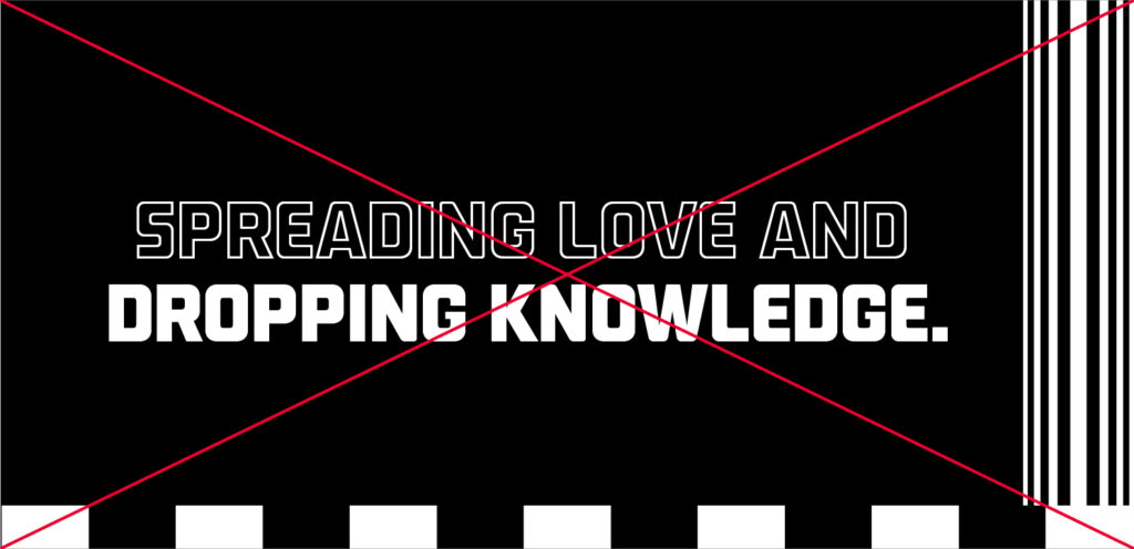
The 5 and 13 brand stripes along with the radiating stripes are created to be separate elements that work independently in the overall visual identity system.
Do not mix the two stripe versions in layout and always try to include The Heart of Sneakers logo lockup somewhere within close proximity when using the radiating stripes.
Do not let the two stripe versions touch or mix with each other and should always be used separately when designing in layout.
Do not truncate or shorten the radiating stripes or brand stripes in any form in layout as the design loses visual recognition and impact.
Heart Icon Dont’s
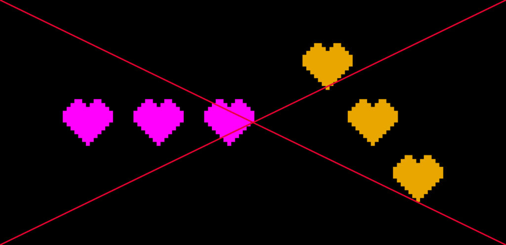
Do not use the heart icons in any other colors or orientations than specified.
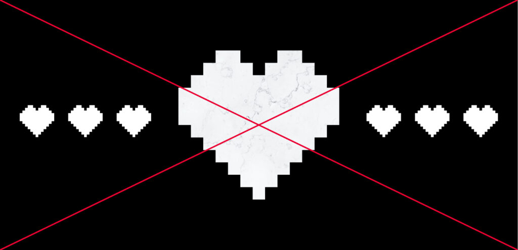
Do not add any textures or images within the heart shape. Do not add depth or drop shadows to the heart icon.
Do not group or arrange the heart icons in various sizes together. Keep the spacing consistent between the heart icons when using more than one. Do not create a window out of the heart icon shape.
If mixing the heart icon with the stripes, keep appropriate spacing and balance between the elements so that it does not become too busy.
Color and Texture Dont’s
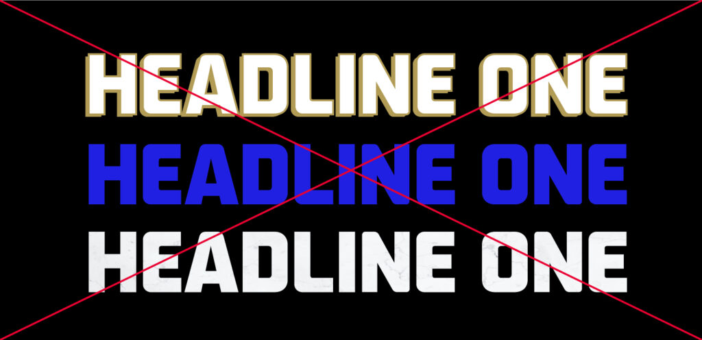
When creating layouts, do not use colors other than what is listed in the toolkit. Do not add texture or drop shadows to the icons, stripes, typography or headlines.
Do not add texture or overlays to the backgrounds when creating layouts. Only use the brand colors of solid black and white. The only texture should come from the color photography backgrounds.
Typography Dont’s
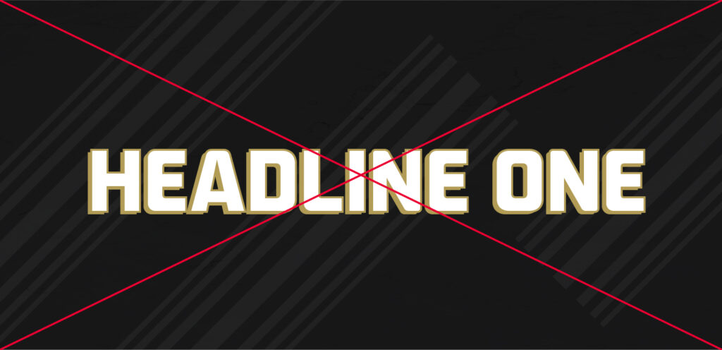
Do not add texture or drop shadows to the typography or headlines.
Do not use any other colors for the typography and headlines other than the brand colors of black and white.
Do not mix or arrange typography and headlines in any other way than what is listed in the toolkit.
