Stripes
Our stripes are one of the most iconic and integral pieces of the brand’s graphic system. Although simplistic, the stripe system provides a powerful graphical element that can easily be identified as uniquely Foot Locker.
Brand Stripes
Brand stripes come in two sizes: broad and narrow. There should always be either 5 broad stripes or 13 narrow stripes.
When using these stripes, be sure to keep them scaled in the same proportion.
For instances where the stripes must be repeated for large-scale formats, use repeating combinations of 5 broad stripes or 13 narrow stripes.


Stripe Misuse
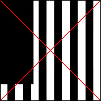
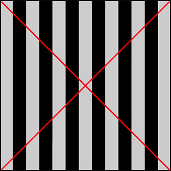
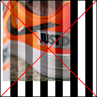
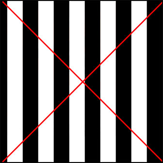
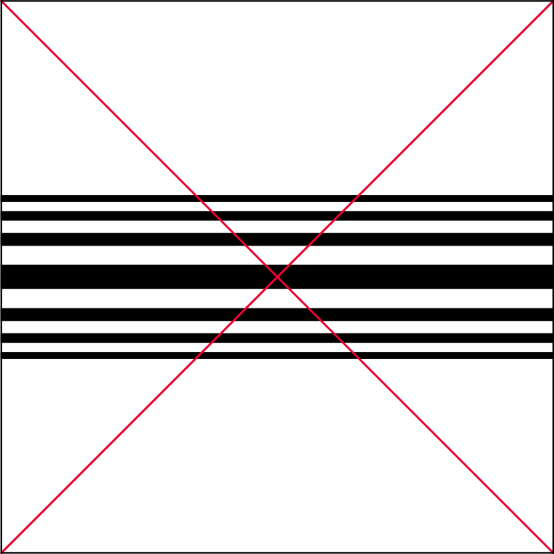
Adhere to the strict guidelines laid out in the previous sections and be sure never to deviate in scale, color, or orientation.
The stripes must never be horizontal.
Be mindful to not present stripes in a way that could be confused for Adidas, Sephora, or other brands.


Radiating Stripes
The radiating stripes are unique to the concept that Foot Locker is The Heart of Sneakers as they visually represent the beating pulse of Foot Locker and employ the same 13 stripes used in the brand. The radiating stripes are spaced out differently from the 13 brand stripes to conceptually allude to a beating pulse.
The radiating stripes are offered in two colorways: black stripes on a solid white background or white stripes on a solid Black background.
When the stripes are applied to color photography, choose the colorway that allows for the most visibility. Specific color usage rules will be detailed further below.


Radiating Stripes Spacing and Sizing Rules
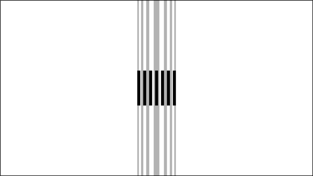
The radiating stripes are built from the 13 stripes used throughout the Food Locker brand. The overall width proportion of the radiating stripes are the same as the 13 brand stripes, but sized and spaced out from the center stripe to conceptually allude to a beating pulse.
The middle stripe is slightly larger width-wise than the width of the brand stripes. The remaining 6 stripes to the left and right of the larger middle stripe (including negative space) are sized down consecutively and incrementally to radiate.
Use the visual guideline reference to properly size and space the radiating stripes against the 13 brand stripes.
Radiating Stripe Misuse
Adhere to the strict guidelines laid out in the previous sections and be sure never to deviate in scale, color, or orientation.
The radiating stripes graphic should not be rearranged or altered in any way. Do not truncate the radiating stripes.


Radiating Stripes Graphic
Radiating stripes may be used as a branding element in graphic executions that connect to headlines and The Heart of Sneakers logos.
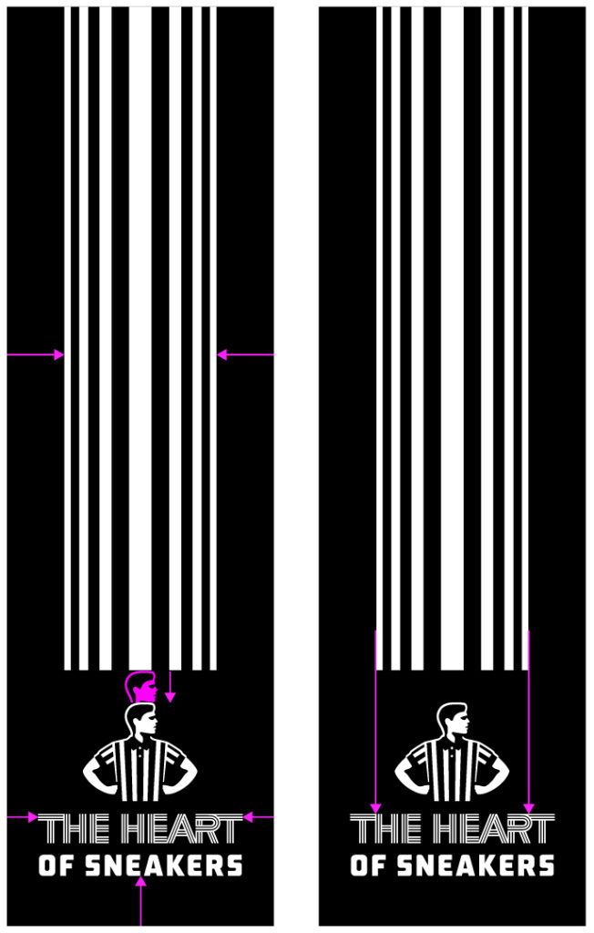
In layout, the radiating stripes graphic should always begin from the top of the frame and meet close to the headline or The Heart of Sneakers primary logo. The radiating stripes should never begin at the bottom of the frame.

Radiating Stripes Graphic Spacing and Sizing Rules
The primary lockup should be spaced below the radiating stripes at least the height of the head of the striper. In some instances, this space may be greater.
In order to determine the width of the radiating stripes in conjunction with the primary logo, ensure that the width of the radiating stripes correlates to the the end of the first “T” in “THE HEART” and the beginning of the last “T” in “THE HEART” custom typeface in the primary logo.
In some cases, the width of the radiating stripe graphic with the primary logo may deviate slightly from these measurements due to layout accommodations needed.
Radiating Stripes Graphic Layout Spacing Rules
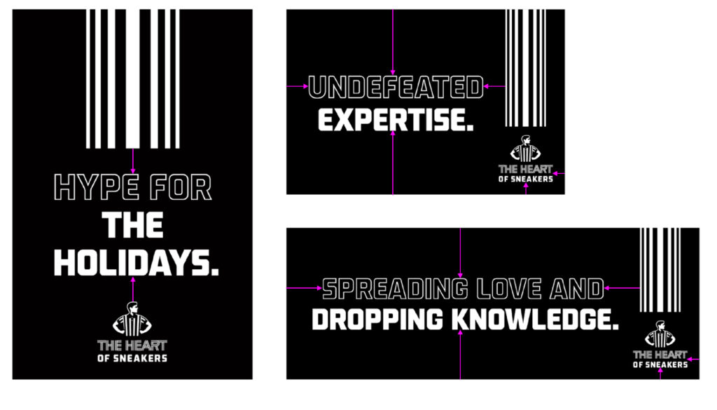
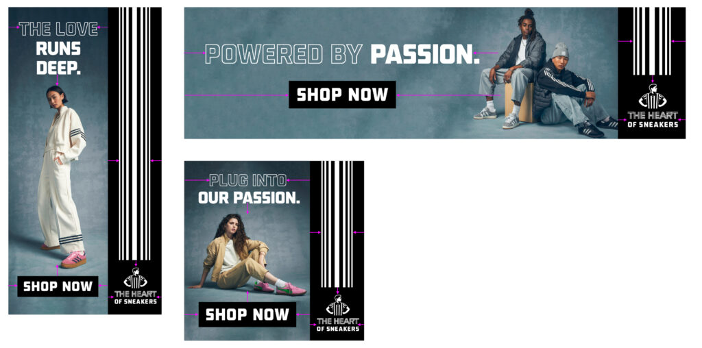
In layouts that feature the black or white strip with image, the radiating stripe graphic should be balanced evenly between the strip. The primary lockup should be spaced below the radiating stripes at least the height of the head of the striper. In some instances, this space may be greater.
If a headline is included in layouts that feature the black or white strip with image, the headline should be centered above the negative space
of the image and should be sized enough to give breathing room.
In social posts that feature the 13 stripe heart strip on image, make sure there is enough negative space around the graphic. The hearts should never touch or overlap subjects or products in the image. When using the radiating stripe graphic with headline and primary lockup, ensure the spacing is the same.

When using the radiating stripe graphic on in-store signage, make sure the spacing is equidistant between elements. On centered layouts where the headline breaks up the stripe and primary lockup, ensure the space is equal between the two elements. On horizontal layouts, the stripe and primary lockup should be equidistant from the corner.
All of the spacing rules listed previously also apply to digital banner applications. Due to the amount of elements that have to work together in a smaller layout, spacing is crucial in this instance. The headlines and “Shop Now” buttons should never overlap or interfere with the image in order to preserve legibility.
Radiating Stripes Photography Rules
Radiating stripes are also used with photography as a branding element that connect to headlines and The Heart of Sneakers logos. Always begin from top of frame and meet with the headline or The Heart of Sneakers primary logo. The radiating stripes should never begin at bottom of frame. The Heart of Sneakers primary logo should be spaced below the radiating stripes at least the height of the head of the striper. In some instances, this space may be greater.
In some instances where there are more subjects in the photograph or there are different placement needs, the graphics can exist over the photography. For accessibility and legibility purposes, the radiating stripes graphic, headline and logo must be utilized in the colorway that makes it clear and provides the most contrast.
For example, when using a darker background, use the white version of these elements. If the background is light, use the black version of these elements. Make sure to never overlap any graphic elements with the subject or image which would make it busy. These elements should always live in the negative space of the background if possible.
