Logo
Our logo system has been distilled to various types of marks, split between the Core Brand and The Heart of Sneakers. There are specific hierarchy and usage for each group. Logos will no longer be region-specific as we look to gain global consistency and brand recognition.
Core Brand Primary Logo: The Striper
The Striper logo without the wordmark is intentional and demonstrates the bold confidence of our brand personality.
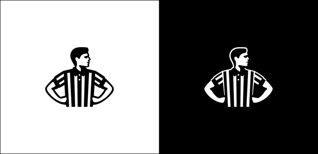
White on black background is the preferred colorway. Black on white background is also an option.
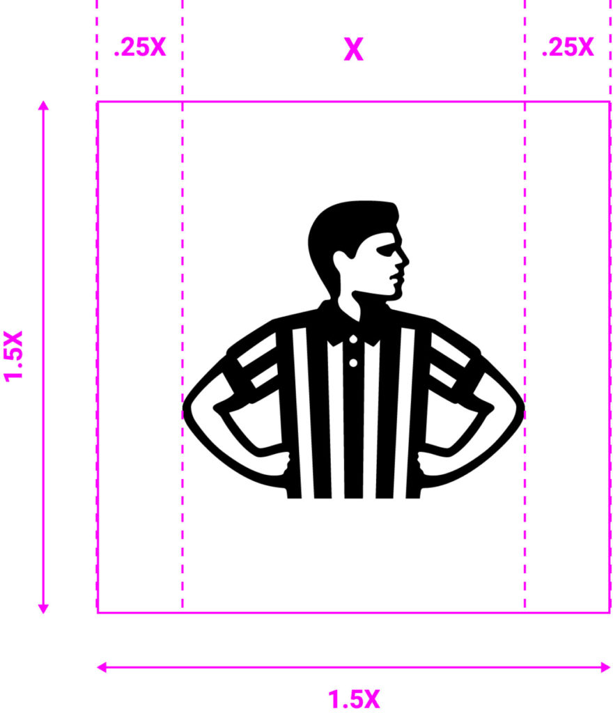
Minimum Clear Space
The clear space around the logo should be X (where X is half the width of the Striper).
Core Brand Primary Logo Usage
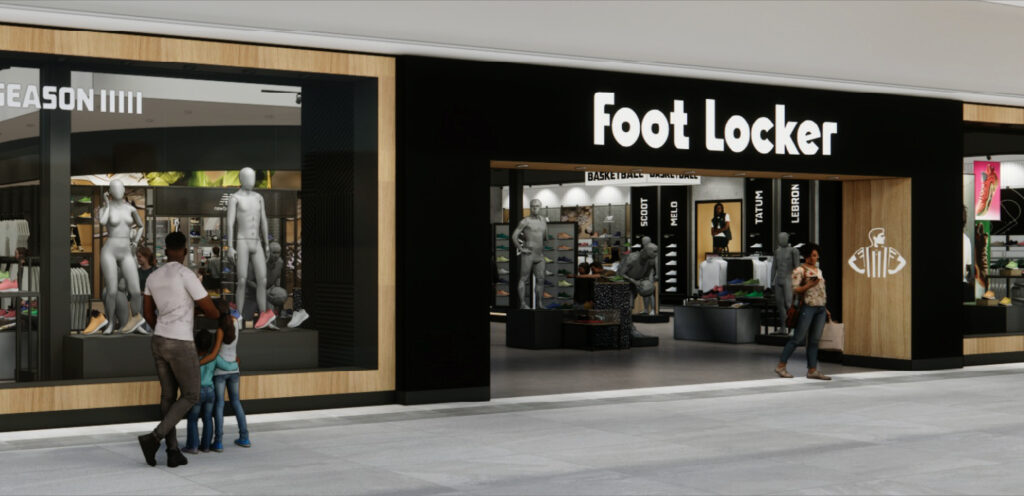
The Striper logo is the primary logo and should be used in 90% of contexts.
The Striper logo should be used in instances where the Foot Locker brand is already established such as in-store, in internal company materials, or in social media.
In markets outside of North America where the Striper icon is not strongly recognized or connected to the Foot Locker brand, always use the Striper logo in lockup with the Wordmark.
Core Brand Secondary Logo: The Wordmark
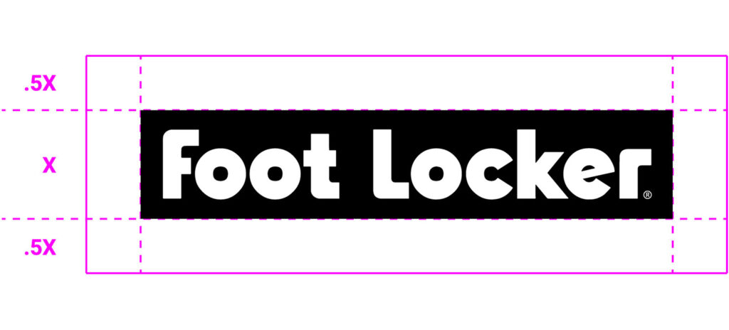
The Wordmark logo must always appear in a block and the block can never be altered.
Only use it on a single line. Do not break “Locker” onto a second line to form a stacked version.
The registered trademark must always be present.

Minimum Clear Space
The clear space around the logo should be X (where X is equal to the height of the box).
Core Brand Secondary Logo Usage
Once the primary logo, the Wordmark now takes on a secondary role.
The isolated Wordmark should be used in places to establish the Foot Locker brand when the Primary Striper logo is not present such as on the website.
Core Brand Tertiary Logo: Striper/Wordmark Lockup
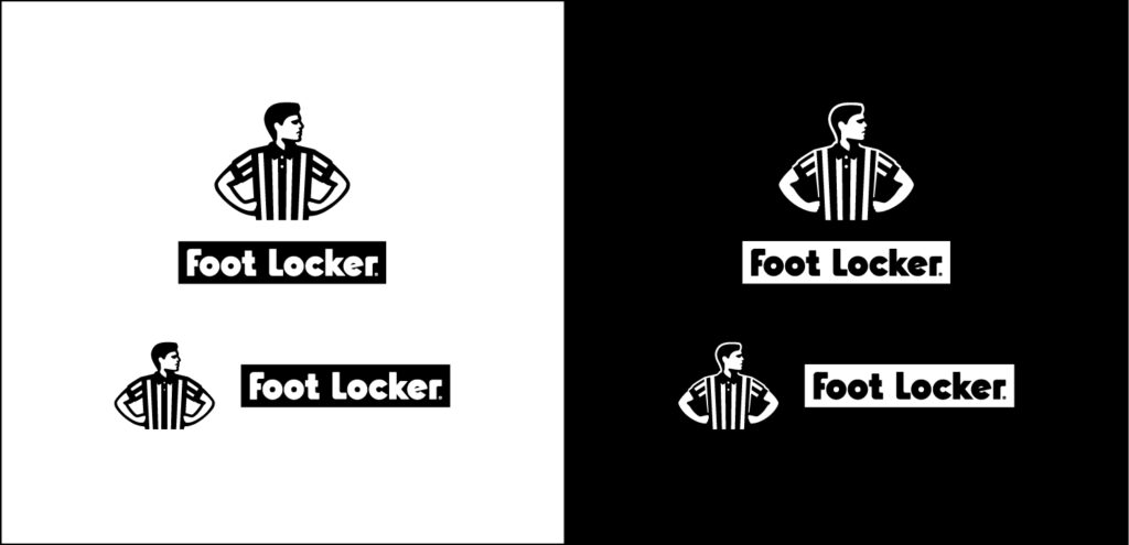
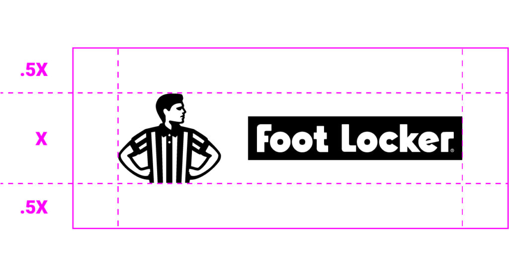
The Core Brand Tertiary logo consists of the Striper icon and the Foot Locker wordmark stacked and in a horizontal format. This lockup brings the two singular brand elements together to establish a strong brand presence.
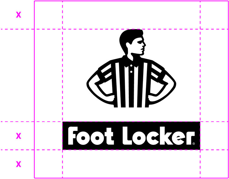
Minimum Clear Space
The clear space around the logo should be X (where X is equal to the height of the box).
Core Brand Tertiary Logo Usage
This lockup should only be used in the rare case that we are needing to represent the brand to an audience that doesn’t know the Foot Locker brand.
Contexts might include investor materials, community outreach programs, or in markets outside of North America.
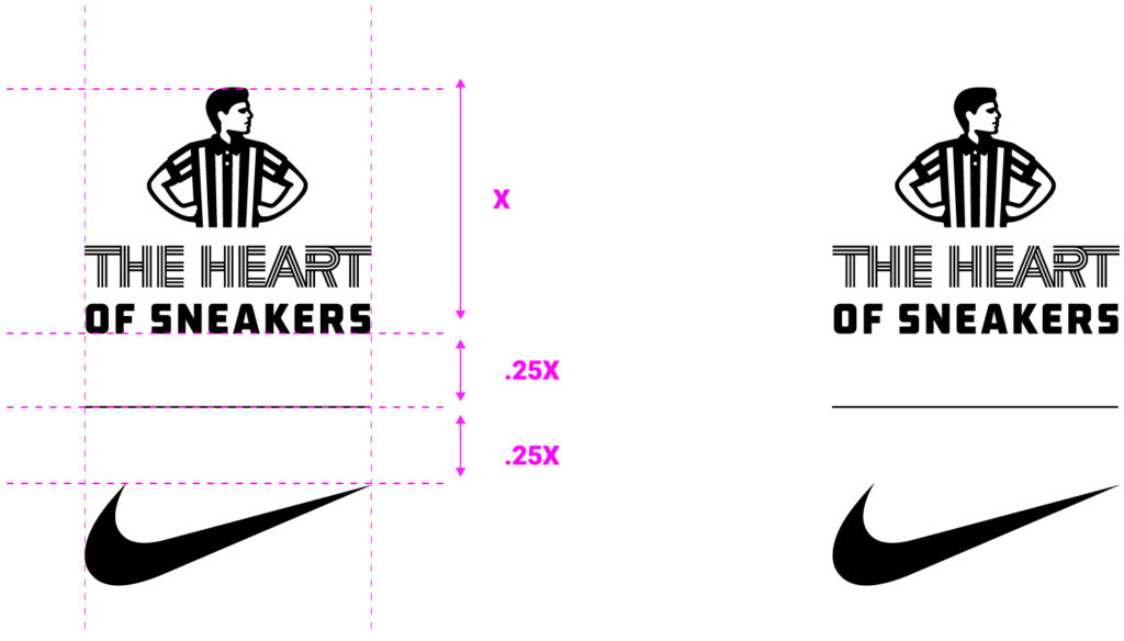
Primary Logo: The Heart of Sneakers
The Heart of Sneakers primary logo uses the Striper Icon. “THE HEART” typography is created as custom outlined artwork and should never be used in a font other than the artwork provided. “OF SNEAKERS” is set in the FL Classic primary brand typeface.
The Heart of Sneakers type lockup should only be set below or to the right of the Striper Icon.
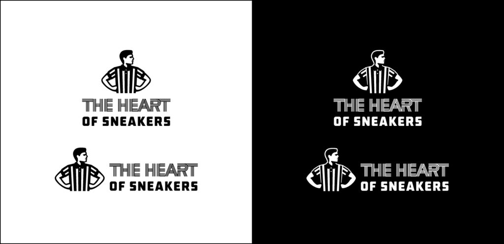
The Heart of Sneakers primary logo can be applied in both vertical (stacked) or horizontal formats. The stacked version should be employed as the first choice whenever space permits. If vertical space is limited, opt for the horizontal version.
White on black background is the preferred colorway. Black on white background is also an option.
Minimum Clear Space
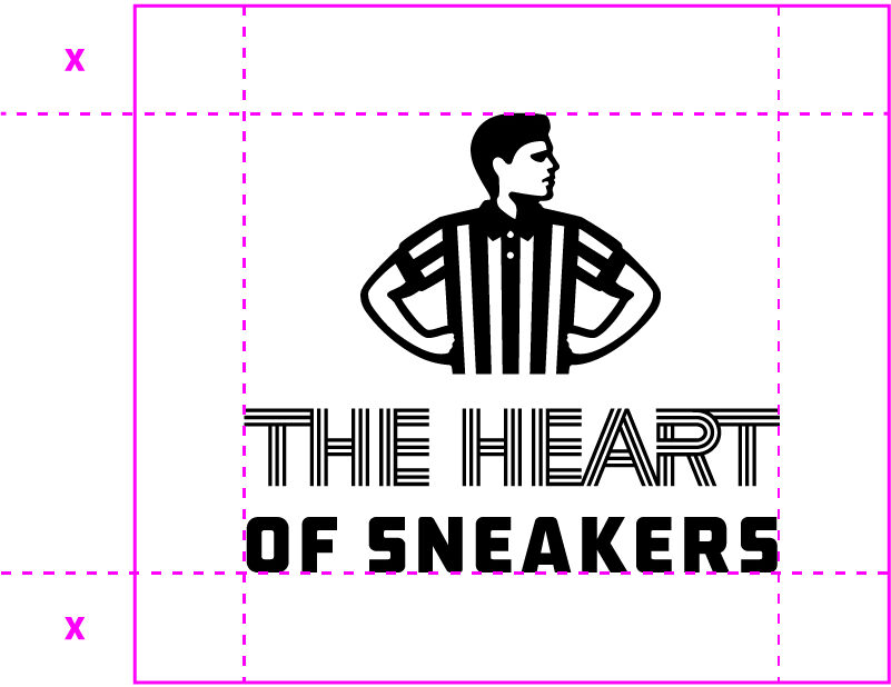
The clear space around the logo should be X (where X is equal to the height of the box).
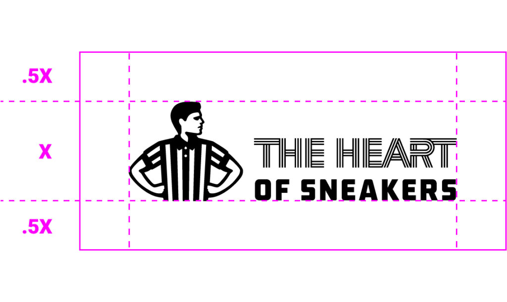
THOS Primary Logo Usage
The Heart of Sneakers primary logo is to be used when the Foot Locker brand is prominent and clearly visible as it does not include the Foot Locker wordmark.
Examples include in-store signage and banners, commercial endcards, and messaging in social media.
One thing to note is that The Heart of Sneakers primary logo should be treated as a sign-off to any messaging where any additional headlines or copy is included.

Secondary Logo: The Heart of Sneakers
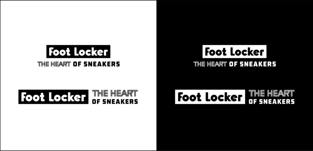
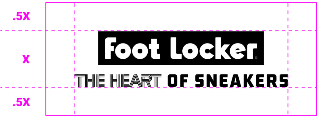
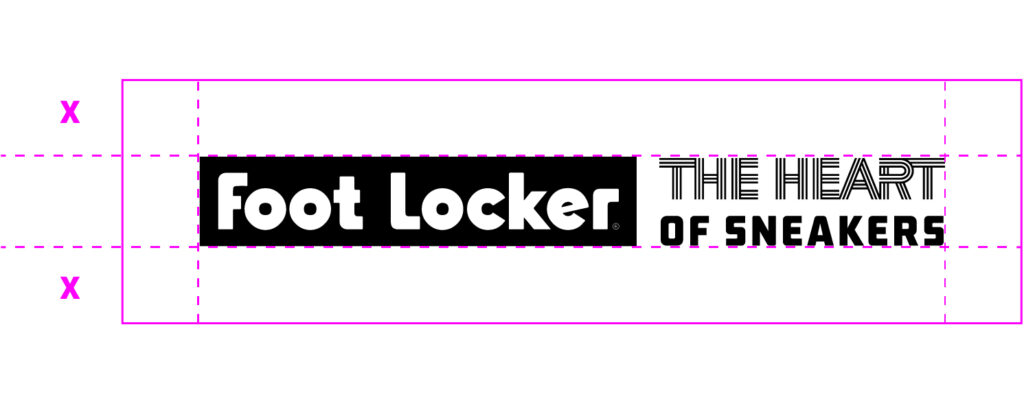
The Heart of Sneakers secondary logo uses the secondary Foot Locker wordmark. On the vertical version, “THE HEART OF SNEAKERS” typography is set on one line under the wordmark. On the horizontal version, “THE HEART OF SNEAKERS” typography is set stacked to the right of the wordmark.
The secondary wordmark must always appear in a block, and the block can never be altered. The Heart of Sneakers type lockup should only be set below or to the right of the secondary wordmark.
The Heart of Sneakers secondary logo can be applied in both vertical (stacked) or horizontal formats. The stacked version should be employed as the first choice whenever space permits. If vertical space is limited, opt for the horizontal version.
White on black background is the preferred colorway. Black on white background is also an option.
Minimum Clear Space
The clear space around the logo should be X (where X is equal to the height of the box).
THOS Secondary Logo Usage
The Heart of Sneakers secondary logo will be employed in instances where the Foot Locker brand presence is not readily apparent yet necessary.
The secondary logo should be used when the Striper logo with The Heart of Sneakers is not enough to establish brand recognition. Examples include instances such as messaging for community outreach programs linked to The Heart of Sneakers.

Tertiary Logo: The Heart of Sneakers
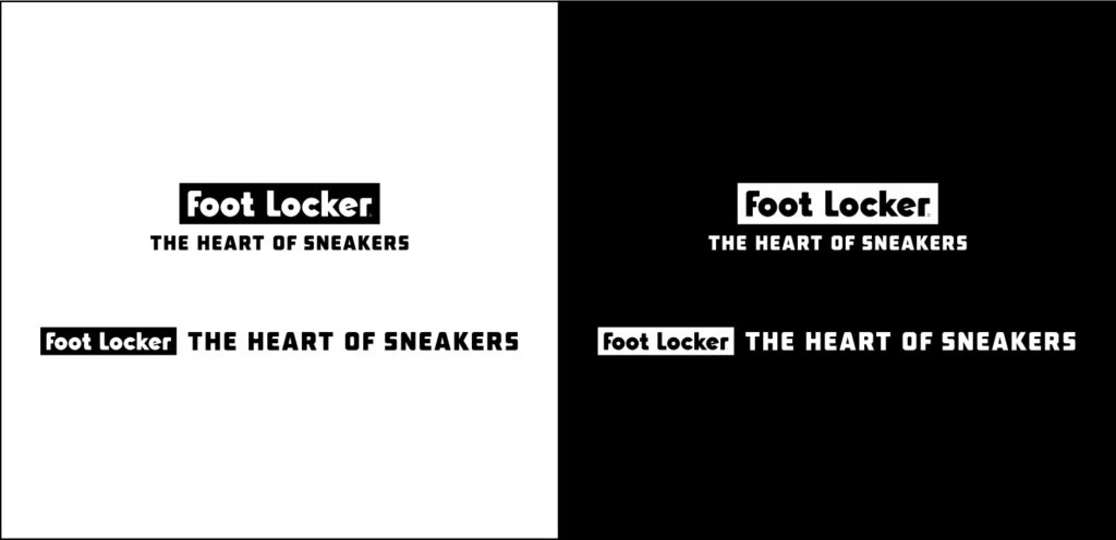
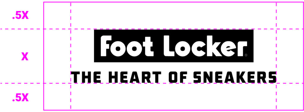
The Heart of Sneakers tertiary logo uses the secondary Foot Locker wordmark. On the tertiary logo, “THE HEART OF SNEAKERS” typography is set on one line all in the FL Classic primary brand typeface. On the vertical version, the typography is set under the wordmark. On the horizontal version, the typography is set to the right of the wordmark.
The secondary wordmark must always appear in a block, and the block can never be altered. The Heart of Sneakers type lockup should only be set below or to the right of the secondary wordmark.
The Heart of Sneakers tertiary logo can be applied in both vertical (stacked) or horizontal formats. The stacked version should be employed as the first choice whenever space permits. If vertical space is limited, opt for the horizontal version.
White on black background is the preferred colorway. Black on white background is also an option.
Minimum Clear Space
The clear space around the logo should be X (where X is equal to the height of the box).

THOS Tertiary Logo Usage
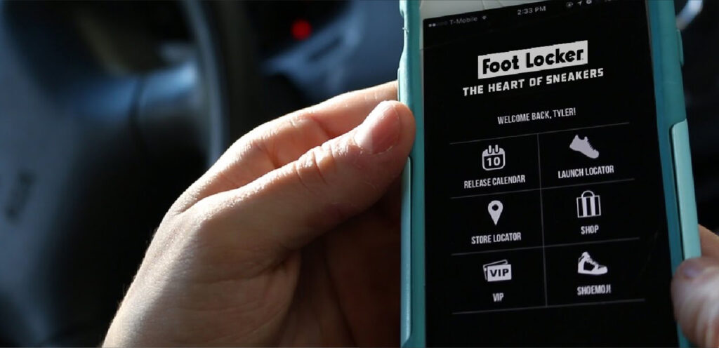
The Heart of Sneakers tertiary logo will be applied in smaller-format spaces where the Foot Locker brand presence is essential but not immediately visible. Use the tertiary logo only when the available space is too small to accommodate The Heart of Sneakers primary and secondary logos, resulting in illegibility. Examples include smaller digital placements such as in apps or email.
The Wordmark: The Heart of Sneakers
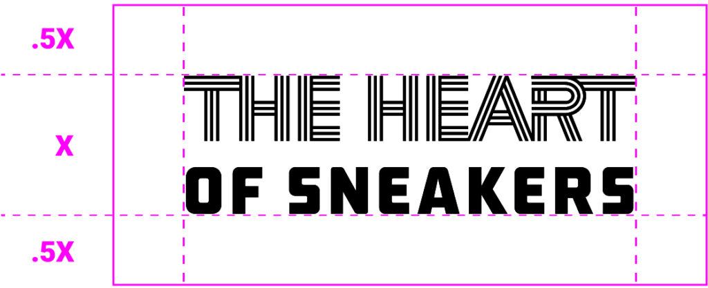
“THE HEART” typography is created as custom outlined artwork, and should never be used in a font other than the artwork provided. “OF SNEAKERS” is set in the FL Classic primary brand typeface.
The Heart of Sneakers wordmark can be applied in both vertical (stacked) or horizontal formats. The stacked version should be employed as the first choice whenever space permits. If vertical space is limited, opt for the horizontal version.
White on black background is the preferred colorway. Black on white background is also an option.

Minimum Clear Space
The clear space around the logo should be X (where X is equal to the height of the box).

THOS Wordmark Usage
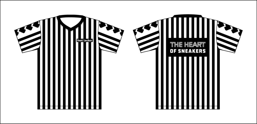
The Heart of Sneakers wordmark should be exclusively used in cases where the tagline is intended to take a more prominent role, such as on printed merchandise like hats, socks, striper jerseys, t-shirts or any other in-store applications.
Always position this lockup in close proximity to the main Foot Locker branding elements, such as the box logo or striper icon, to ensure clear brand recognition and connection.

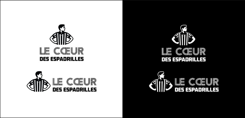
FLCA Logo: The Heart of Sneakers
This is the primary logo version for The Heart of Sneakers in French Canada. All of the above primary logo usage rules and minimum clear space applies. This logo should only be used in French-Canadian markets.
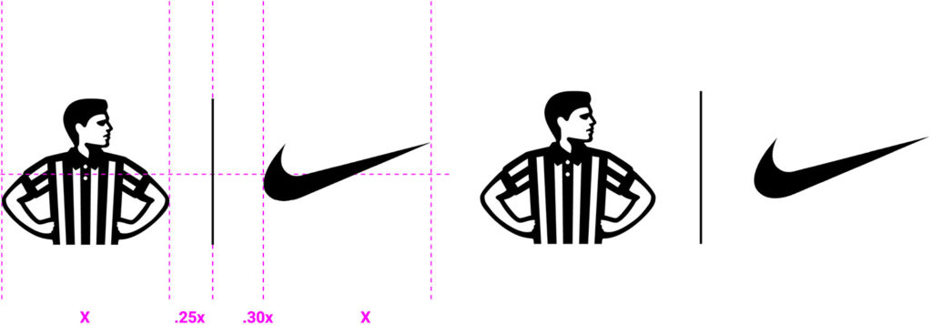
Partnership Lockups: Core Brand
Horizontal Lockup
Always put The Striper first. Partner logos should never be larger than The Striper.
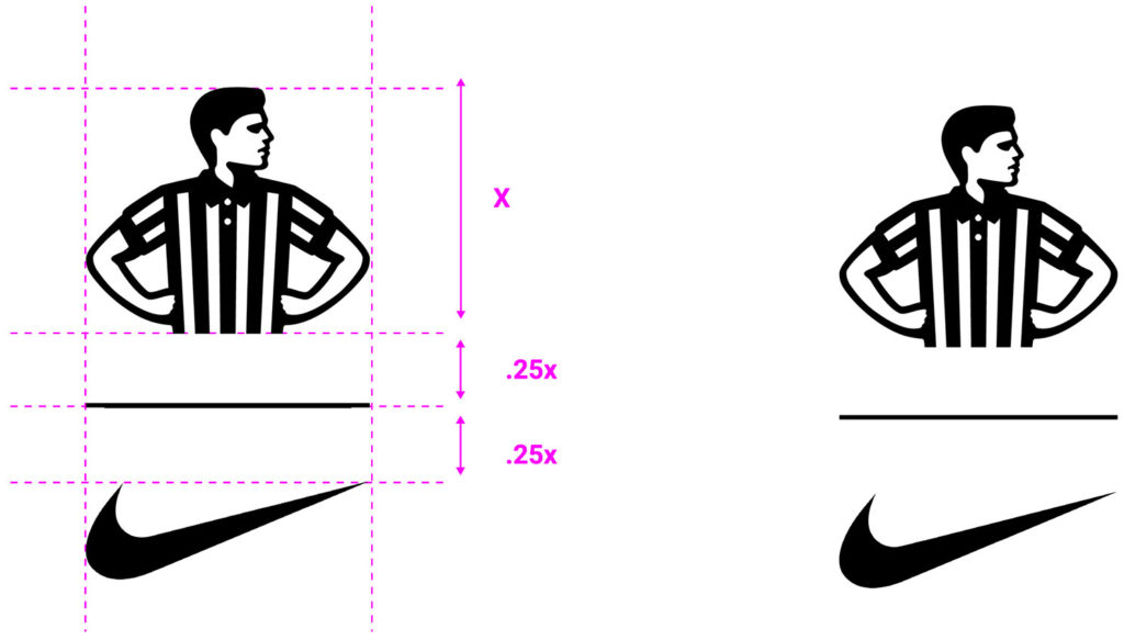
Vertical Lockup
Always put The Striper first. Partner logos should never be larger than The Striper.
Partnership Lockups: The Heart of Sneakers
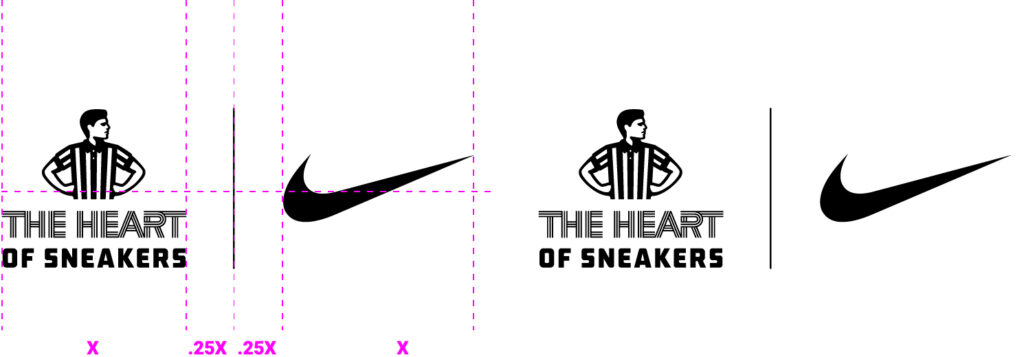
Horizontal Lockup
Always put the primary The Heart of Sneakers logo with the Striper first. Partner logos should never be larger than the primary The Heart of Sneakers lockup.
Vertical Lockup
Always put the primary The Heart of Sneakers logo with the Striper first. Partner logos should never be larger than the primary The Heart of Sneakers lockup.
