FLX Rewards Logo
The FLX Rewards logo was created to identify Foot Locker, Inc’s loyalty program. The logo is complimentary to the banner logos in cases where they will be used together.
FLX Rewards Brand Primary Logo
The FLX Rewards logomark comprises of three individual boxes with the letters F, L, and X followed by a longer rectangle housing ‘Rewards’ laid out horizontally. This is the primary lockup and will be used the most across all touchpoints. The logo is inspired by the stripes by creating negative spaces between the boxes. Its simplicity in forms allows for maximum legibility and additionally is italicized to connote sneaker drops and speed.

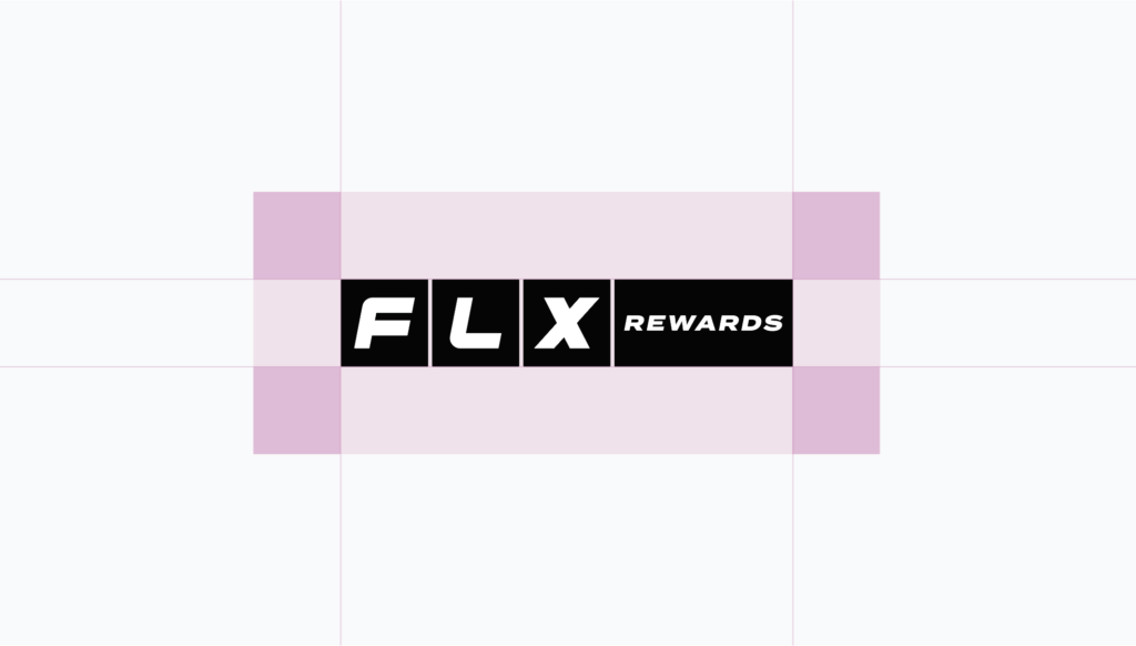
Logomark Clear Space
To ensure maximum legibility and allowing the logo to look its best, there should be ample clearspace around the mark. The correct amount of space around the logo should be equivalent to at least one the height and width of one of the FLX boxes.
Logomark Orientation
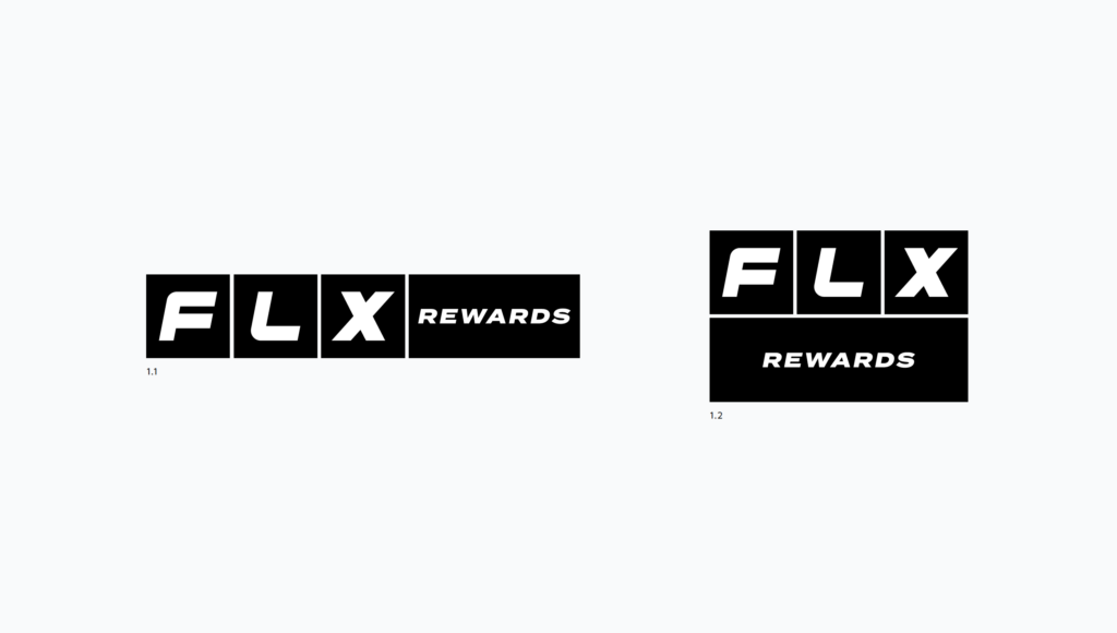
The FLX Rewards logomark can be oriented in two different ways. [1.1] acts as our primary lockup while [1.2] can also be used in larger moments or when space doesn’t allow for a longer horizontal lockup. The longer rectangular boxes can be replaced with various information such as ‘Membership’, etc.
Logomark Minimum Sizes
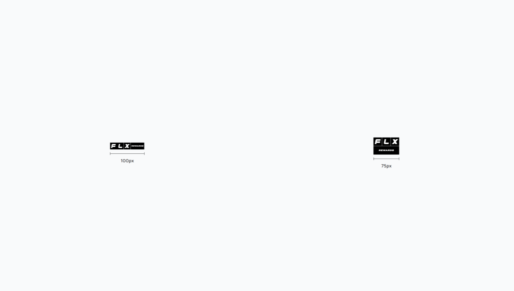
Continuing to allow for legibility, we want to insure that the marks are legible in smaller sizes. Avoid going smaller than a 100px width for the horizontal mark and 75px for the stacked mark. The bigger the size, the more legibility.
FLX Rewards Brand Logo: Additional Lockups
QR Code Lockup
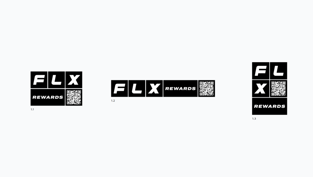
If additional information like the QR code is needed such as the website, refer to the lockups below. Things to consider is the space around the code itself to create a bit of a border.
FLX Membership Lockup
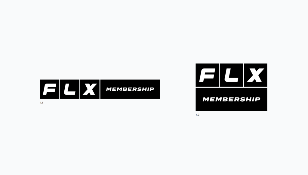
The FLX Membership logo is used in our EMEA market. The FLX Membership lockup will be structured similarly. Instead of ‘Rewards’, ‘Membership’ will be placed within that rectangle and stretched slightly longer to fit the whole word.
FLX Rewards Secondary Logo
Ideally, the logo should always be used with the boxes. In the rare instance where the boxes cannot be used, refer to the lockup below.

Secondary Lockup Clearspace
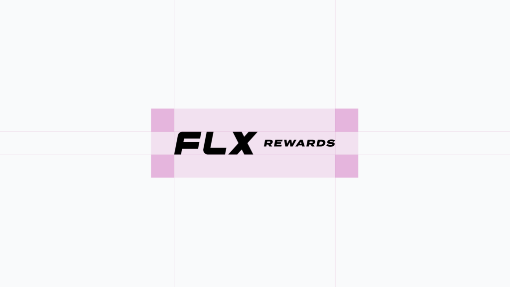
To ensure maximum legibility and allowing the secondary lockup to look its best, there should be ample clearspace around the mark. The correct amount of space around the logo should be equivalent to at least one the height of the “F”.
Secondary Lockup Orientations
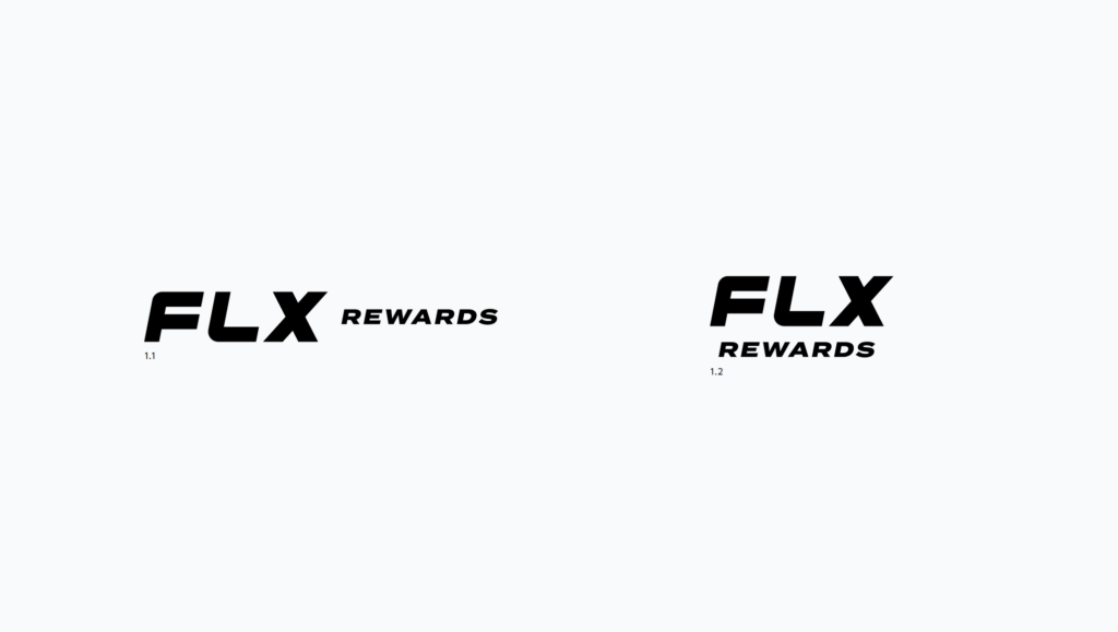
The secondary lockup can be oriented in two different ways. [1.1] acts as the horizontal lockup while [1.2] can also be used in larger moments or when space doesn’t allow for a longer horizontal lockup.
Secondary Lockup Minimum Sizes
Continuing to allow for legibility, we want to insure that the marks are legible in smaller sizes. Avoid going smaller than a 100px width for the horizontal mark and 50px for the stacked mark. The bigger the size, the more legibility.
