Kids Foot Locker Logo
The Kids Foot Locker logo plays off Foot Locker’s global brand platform: The Heart of Sneakers. It captures a youthful presence across all touchpoints, resonating with kids under 13 & their parents. There are specific hierarchies & uses to ensure it remains easily recognizable.
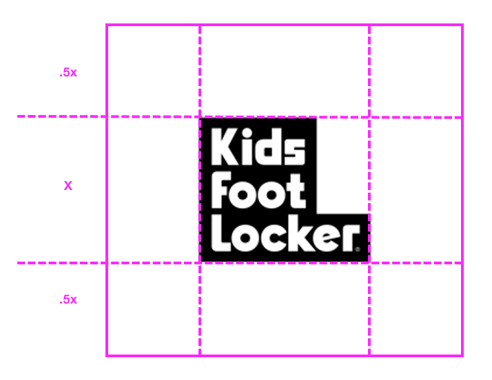
Kids Foot Locker Primary Logo: Stacked
This logo highlights our brand identity: Bold. Confident. Expressive. We see it as the most forward-facing representation of how we show up.
The white on black background is the preferred usage. Black on white is a secondary option for certain use cases.

Kids Foot Locker Primary Logo: Horizontal
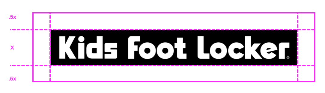
This logo carries the same significance as the stacked version. The wordmark must always be in a block and cannot be changed to another look.
Make sure it’s used on a single line. Don’t move ‘Locker’ to a second line to create a stacked version.
Minimum Clear Space
This logo carries the same significance as the stacked version. The wordmark must always be in a block and cannot be changed to another look.
Make sure it’s used on a single line. Don’t move ‘Locker’ to a second line to create a stacked version.