General Misuses
The toolkit has been created with specific rules and guidelines in place to ensure the best visual representation of the Kids Foot Locker brand. Here are some examples of how not to use the toolkit elements when creating various assets.
Logo Don’ts
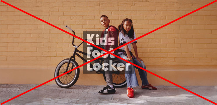
The stacked & horizontal logos for Kids Foot Locker present & defined look & feel. Don’t add outlines to any of the logos. Keep the design clean & simple. There’s no need to include additional elements. It runs the risk of creating confusion related to our brand’s aesthetic.
For logo lockups featuring our brand logos, don’t add any icons or elements near it.


Curved Stripes Misuse
What NOT to do
Stripes should not be ‘skinny’ and should not utilize more than 25% of negative space.
Avoid covering head, face or product.
Optimal areas for the stripes are all four corners or top bottom left and right sides.
For single talent images 2-3 stripes maximum.
For group talent image 1-2 stripes maximum.
Stripe should not compete with the logo, or product.
Stripes should feel as if they have a continuous flow in an out of the frame.


Color and Texture Dont’s
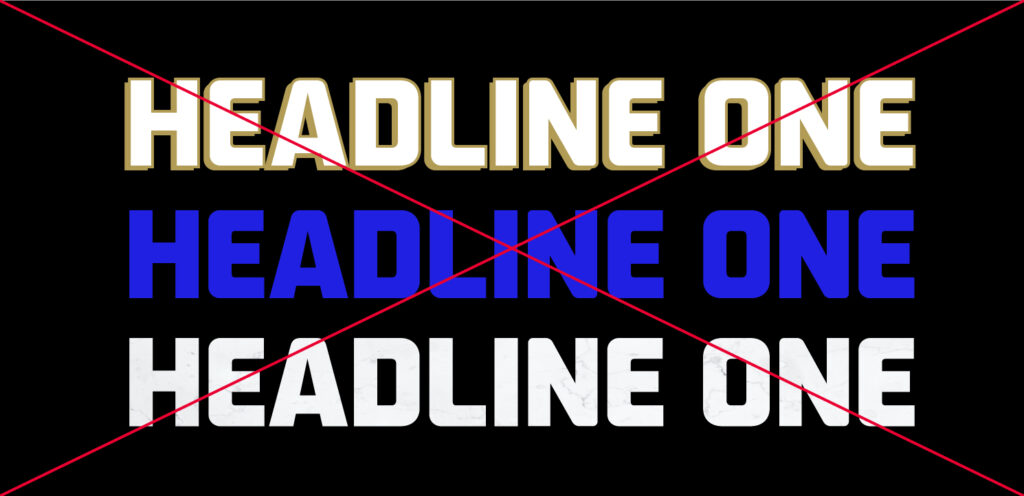
When creating layouts, do not use colors other than what is listed in the toolkit. Do not add texture or drop shadows to the icons, stripes, typography or headlines.
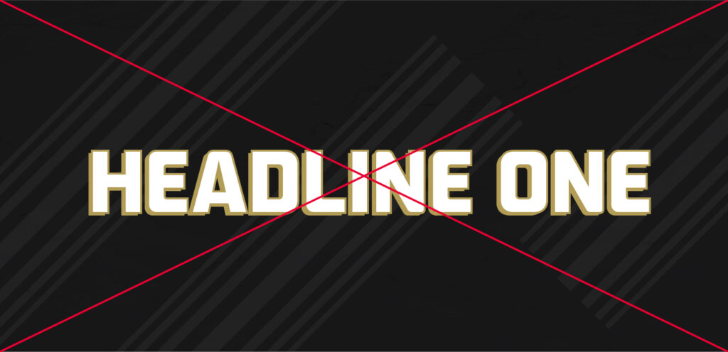
Do not add texture or overlays to the backgrounds when creating layouts. Only use the brand colors of solid black and white. The only texture should come from the color photography backgrounds.
Typography Dont’s
Do not add texture or drop shadows to the typography or headlines.
Do not use any other colors for the typography and headlines other than the brand colors of black and white.
Do not mix or arrange typography and headlines in any other way than what is listed in the toolkit.